Good design is innovative
Good design makes a product useful
Good design is aesthetic
Good design makes a product understandable
Good design is unobtrusive
Good design is honest
Good design is long-lasting
Good design is thorough down to the last detail
Good design is environmentally friendly
Good design is as little design as possible
Friday 22 January 2010
Wednesday 20 January 2010
A Digital Scrap Book that works

For years I've collected things I find interesting and inspiring, most end up in a folder somewhere on my computer, the better stuff will end up on the wall. All the guys I work with do a similar thing, but we all agree, we rarely look at all the stuff we have collected.
So yesterday I grabbed all my files and put them into a little digital photoframe, it sits on my desk and serves up little nuggets of inspiration through out the course of the day.
With a bit of luck the video will be working soon.
With a bit of luck the video will be working soon.
Tuesday 19 January 2010
The fold is dead, long live the fold
This article from CX Partners demonstrates, based on the findings of user testing, why it is no longer vital to get all your content above the page fold.
However, how we design the area above the fold does effect the likely hood of somebody exploring further down the page. For example, having less above the fold actually encourages exploration as shown in the results of this eye tracking test for Bristol Airport.

Read the full article here.
However, how we design the area above the fold does effect the likely hood of somebody exploring further down the page. For example, having less above the fold actually encourages exploration as shown in the results of this eye tracking test for Bristol Airport.

Here are their three tips to encourage user to explore below the fold:
Less is more – don’t be tempted to cram everything above the fold. Good use of whitespace and imagery encourages exploration.
Stark, horizontal lines discourage scrolling - this doesn’t mean stop using horizontal full width elements. Have a small amount of content just visible, poking up above the fold to encourage scrolling.
Avoid the use of in-page scroll bars - the browser scrollbar is an indicator of the amount of content on the page. iFrames and other elements with scroll bars in the page can break this convention and may lead to content not being seen.
Read the full article here.
Monday 18 January 2010
Next Generation Symbian UI

Screen shots of what Nokia wants to see in the next generation Symbian^4 UI.
As posted on The Register
The titlebar has new, more compact signal strength and battery indicators that appear no matter what app you're in. The title is application-dependent - on the homescreen, it would name the operator, for example - and would double-up as a tappable space to call up a dropdown Options menu, signalled by the down-facing triangle.Read the full article here.
Edit
Here is a little more about this story
Tuesday 12 January 2010
Ambient User Experience
An article about Ambient User Experience, that is the elements that don't server a vital function on a web site, but none-the-less build part of the overall experience.
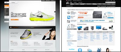
Here's a couple of examples of stores that reflect very different personalities through the UX: Nike vs Dell
Obviously they are visually very different, but look beyond that at the way they function. Nike is playful with lots of gadgets while Dell is almost purely functional and yet both allow the user achieve a similar objective, to choose, customise and buy a product.
Thursday 7 January 2010
Gesture based interaction comes of age - maybe
The cheesy promo videos I have seen about Project Natal to date have always put me off...
...but watching this, I'm thinking again.
Loads more info about Project Natal here.
...but watching this, I'm thinking again.
Loads more info about Project Natal here.
Don Norman and Emotional Design
Don Norman's book The Design of Everyday Things was one of the first books I read about user experience, or ergonomics as we were calling then. Here he talks about the emotion side of UX and how it can make you happy.
Monday 4 January 2010
Subscribe to:
Posts (Atom)